
1. Concept Development:
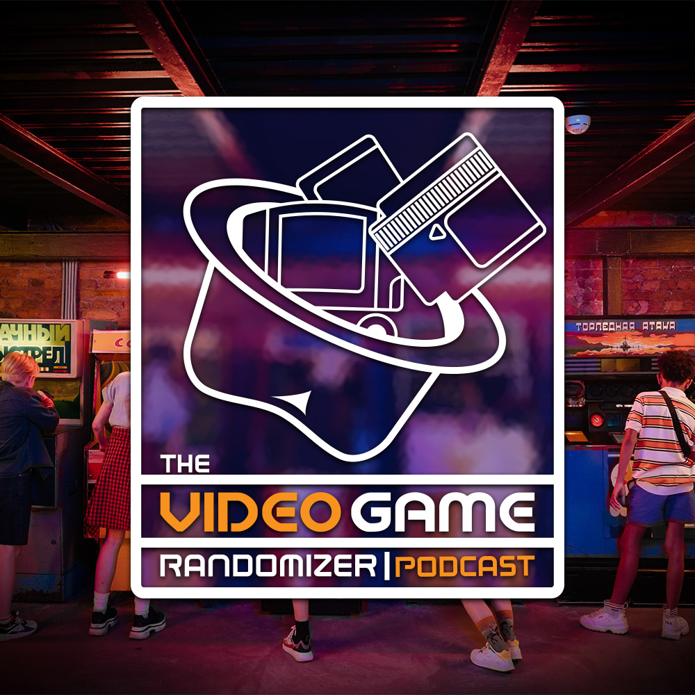
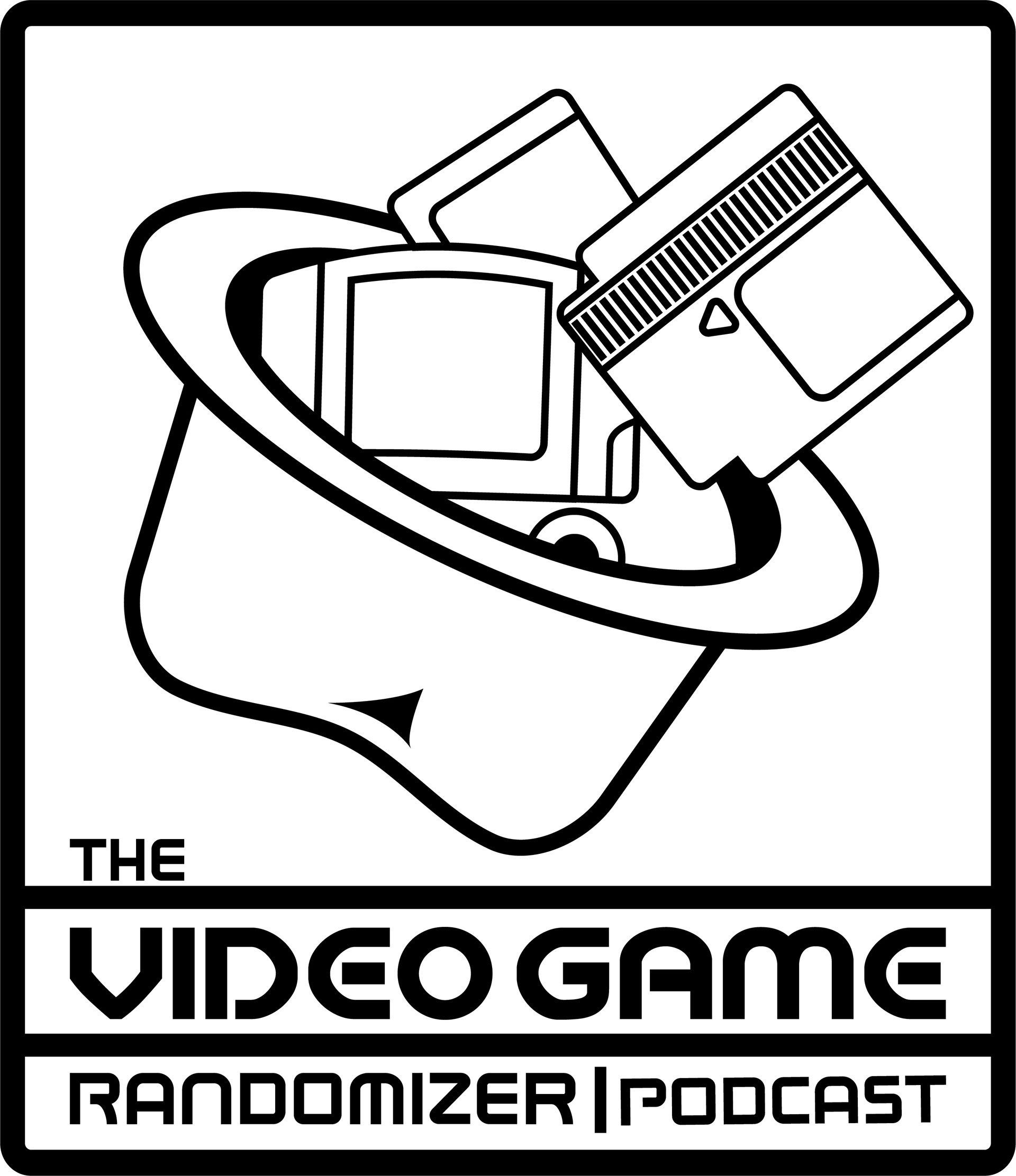
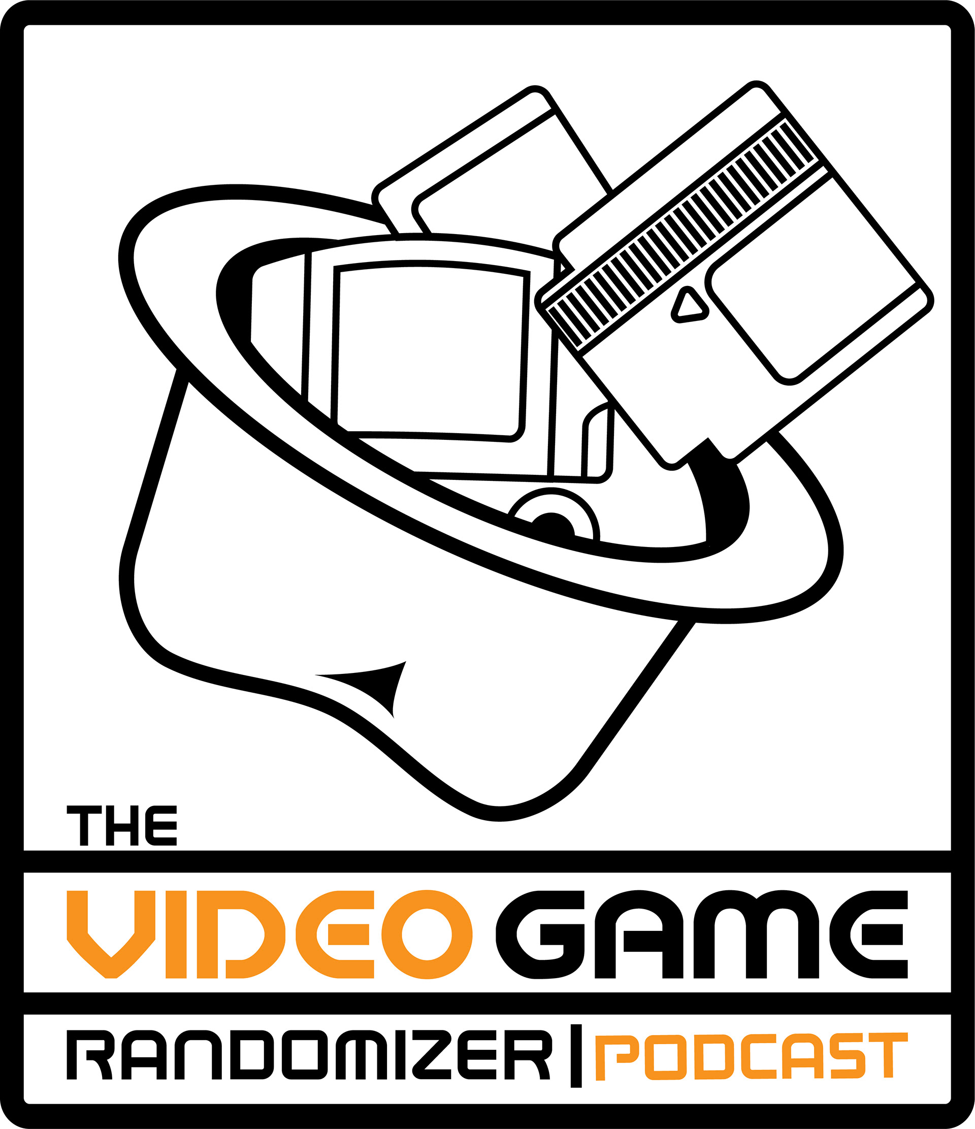
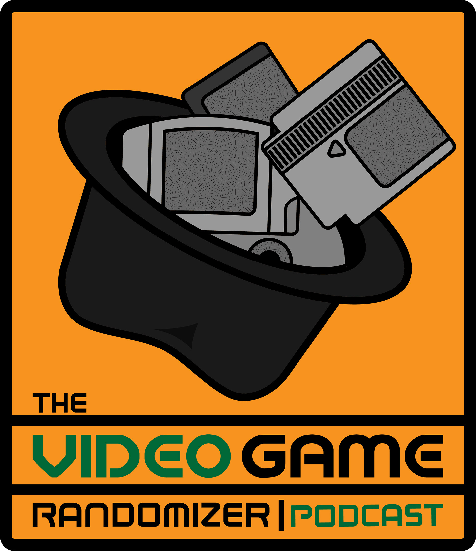
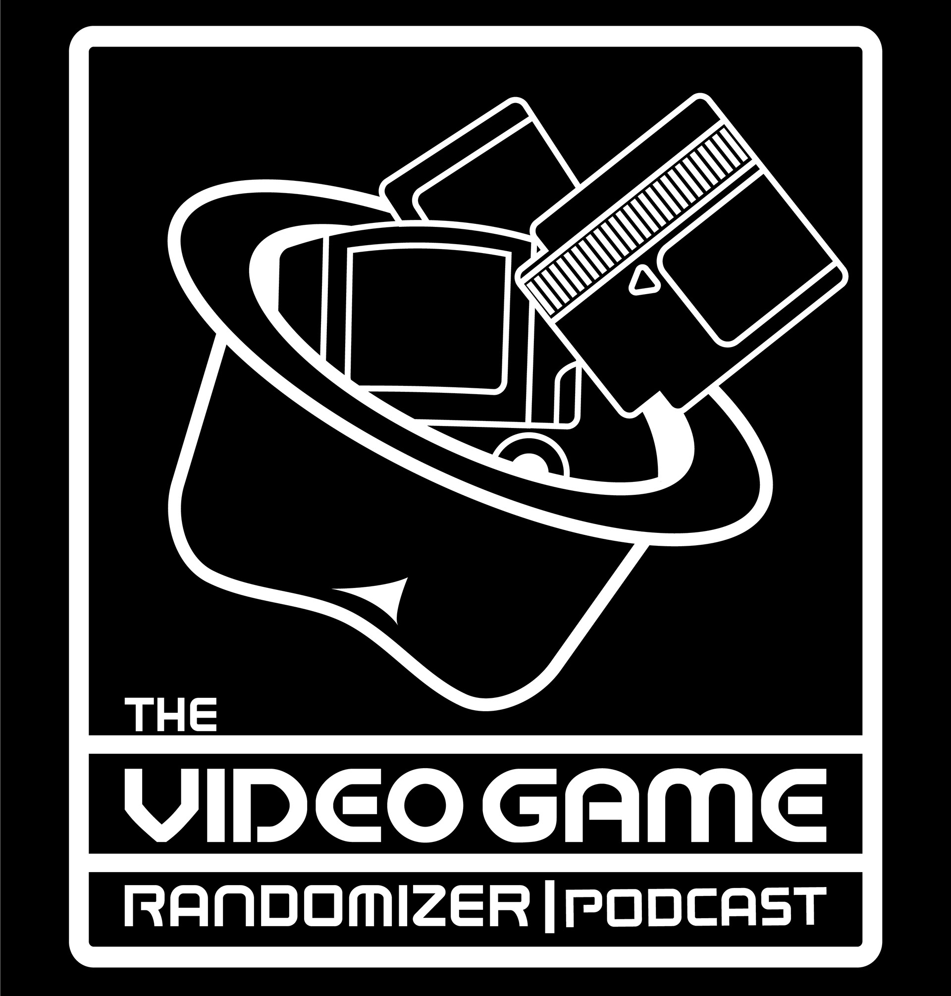
The initial concept centered on representing the randomness of game selection using a visual metaphor. I envisioned a classic hat with video games spilling out, symbolizing the unpredictability of game choices.
2. Research and Inspiration:
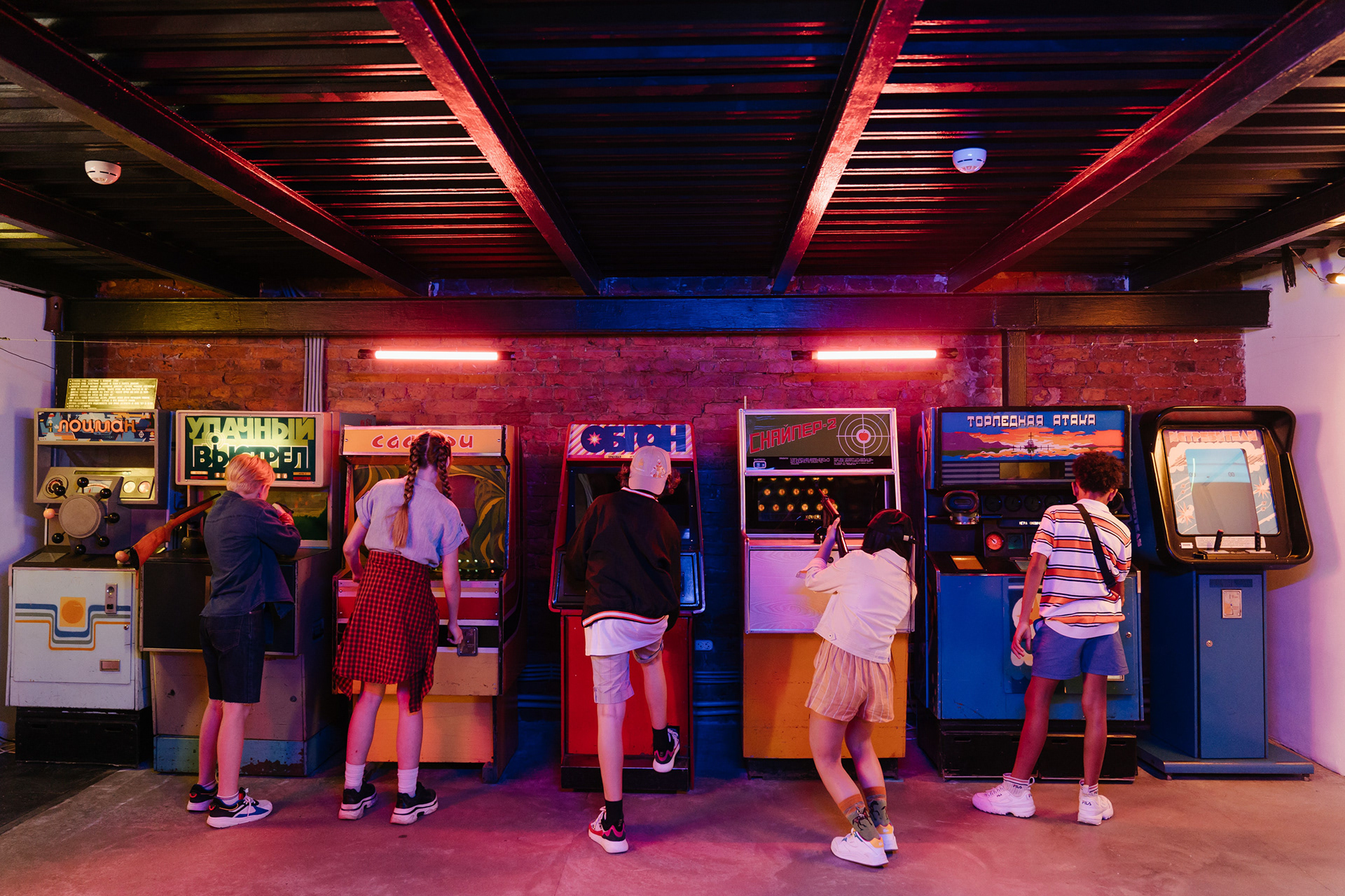
I delved into the world of video games, examining both retro and modern game aesthetics. This research allowed me to blend elements from different eras into the design.
3. Design Elements:
The central element of the logo was the hat, chosen to evoke the idea of drawing lots or picking from a container. The hat itself featured a combination of classic and contemporary video game imagery to reflect the variety of games discussed on the podcast.
4. Typography:
Selecting the right typography was crucial in conveying the podcast's theme. I opted for a font that combined a playful, retro feel with a modern touch, ensuring that the podcast's title stood out.
5. Color Palette:
I chose a color palette that harmonized with the gaming theme. Vibrant colors were used to make the logo pop, and I made sure they were balanced to maintain a visually appealing composition.
6. Composition and Layout:
I carefully structured the logo to ensure that the hat and the spilling games were the focus. The composition was designed to be balanced and engaging, drawing the viewer's attention to the heart of the design.
7. Prototyping and Feedback:
I created prototypes to visualize how the logo would appear in different contexts, such as podcast cover art, social media profiles, and merchandise. Feedback from peers and potential listeners played a crucial role in refining the design.
8. Finalization and Production:
The final logo design was polished to be versatile, allowing for various applications, including both digital and print formats. Attention to detail was given to ensure that the logo remained crisp and clear, regardless of its size.
9. Presentation and Branding: - To strengthen the podcast's identity, I incorporated the logo into the podcast cover art and overall branding. The logo's playful and unpredictable nature aligned with the show's core concept.