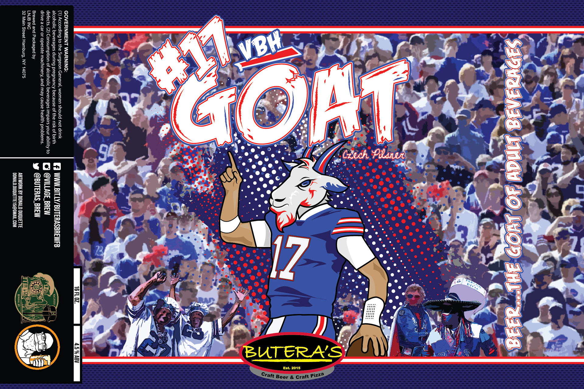
1. Concept Development:
The concept for "The Goat" centered around the idea of celebrating Josh Allen as the "greatest of all time" in recent Buffalo sports history. The goat's head illustration symbolized his status as the best. The Buffalo Bills theme was integral to the design.
2. Research and Inspiration:
To create an authentic representation, I delved into Buffalo Bills' history, fan culture, and the iconic moments involving Josh Allen. This research helped inform the visual elements and design direction.
3. Illustration:
Josh Allen with a Goat's Head: The central element of the label was a custom illustration of Josh Allen with a goat's head, symbolizing his status as the greatest. This created a striking and memorable image for the label.
Background: In the background, I illustrated a mishmash of stadium fans, capturing the spirit of Buffalo Bills games. I included fan favorite local characters to create a sense of community and add local flavor to the design.
4. Aesthetic and Color Theme:
Bold Grungy Aesthetic: The choice of a bold, grungy aesthetic was intended to convey the toughness, action, and passionate spirit of Buffalo and its sports fans.
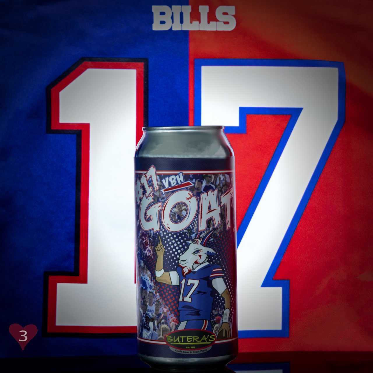
Color Palette: The color theme echoed the Buffalo Bills' iconic red, white, and blue, instilling a strong sense of team spirit and loyalty into the design.
5. Typography:
The font chosen had a bold and impactful appearance, fitting the grungy aesthetic and reinforcing the design's tough and energetic tone.
6. Composition and Layout:
Careful consideration was given to the arrangement of elements to ensure that Josh Allen's illustration and the goat's head were the focal points of the label. The background composition was designed to be visually engaging, with familiar local characters adding depth.
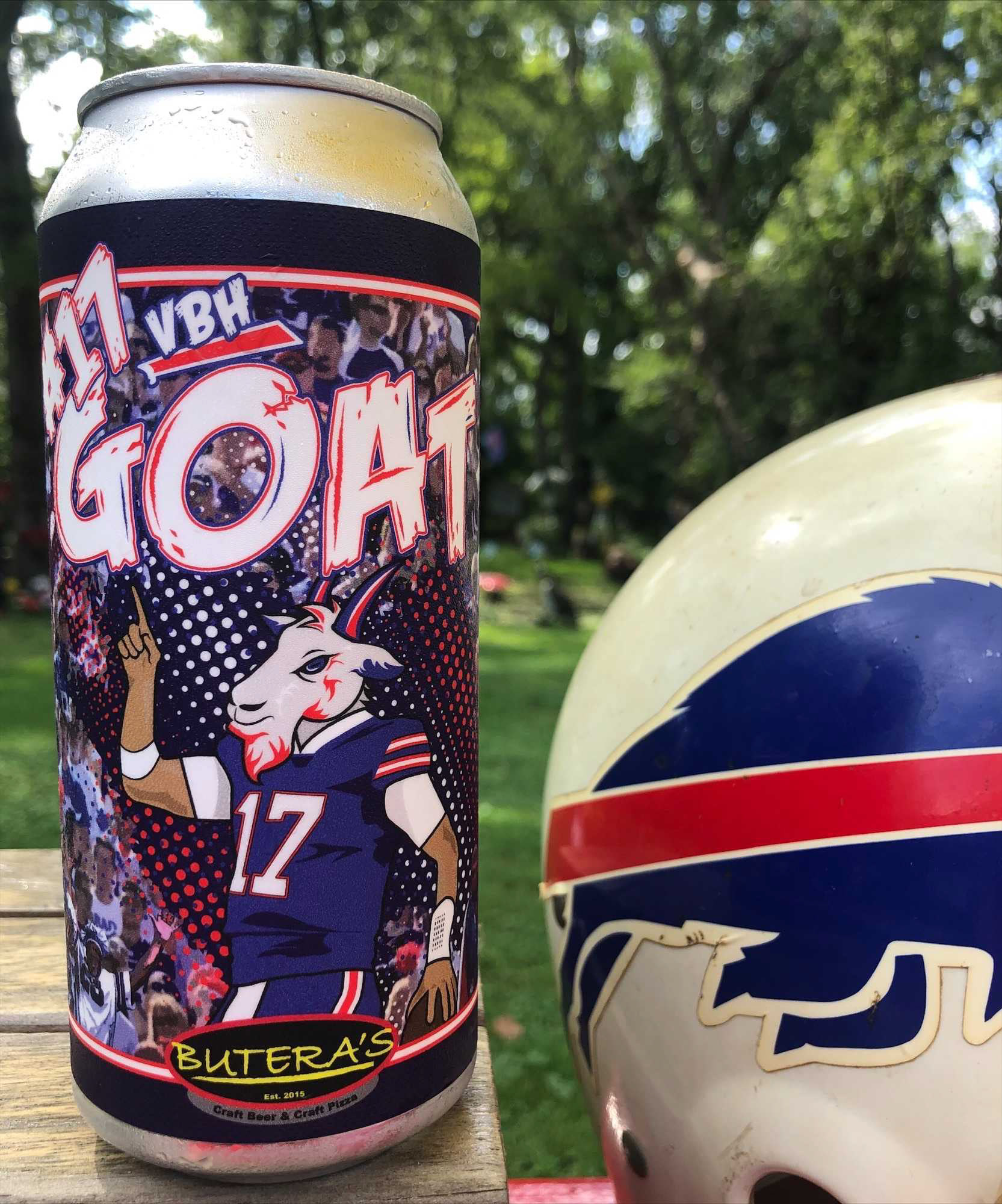
7. Prototyping and Feedback:
Prototypes of the label were created to visualize how it would appear on a beer can. Feedback from peers and potential consumers was sought to fine-tune the design and ensure it effectively captured the sports and local culture elements.
8. Finalization and Production:
The final label design was refined to be high-resolution and print-ready, preserving the intricate details of the illustrations, the grunge aesthetic, and the Buffalo Bills color theme.