1. Concept Development:
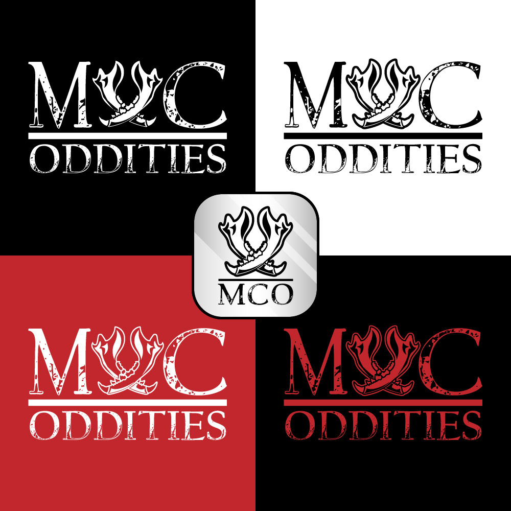
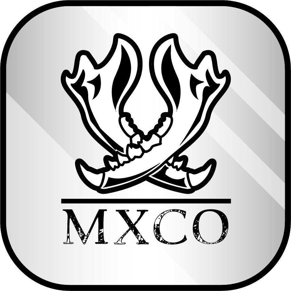
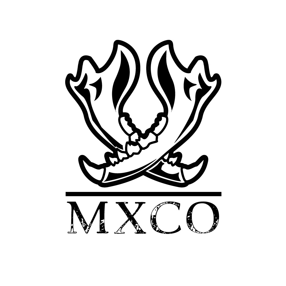
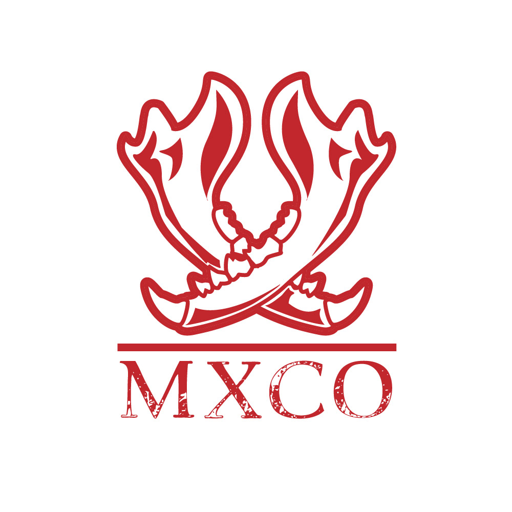
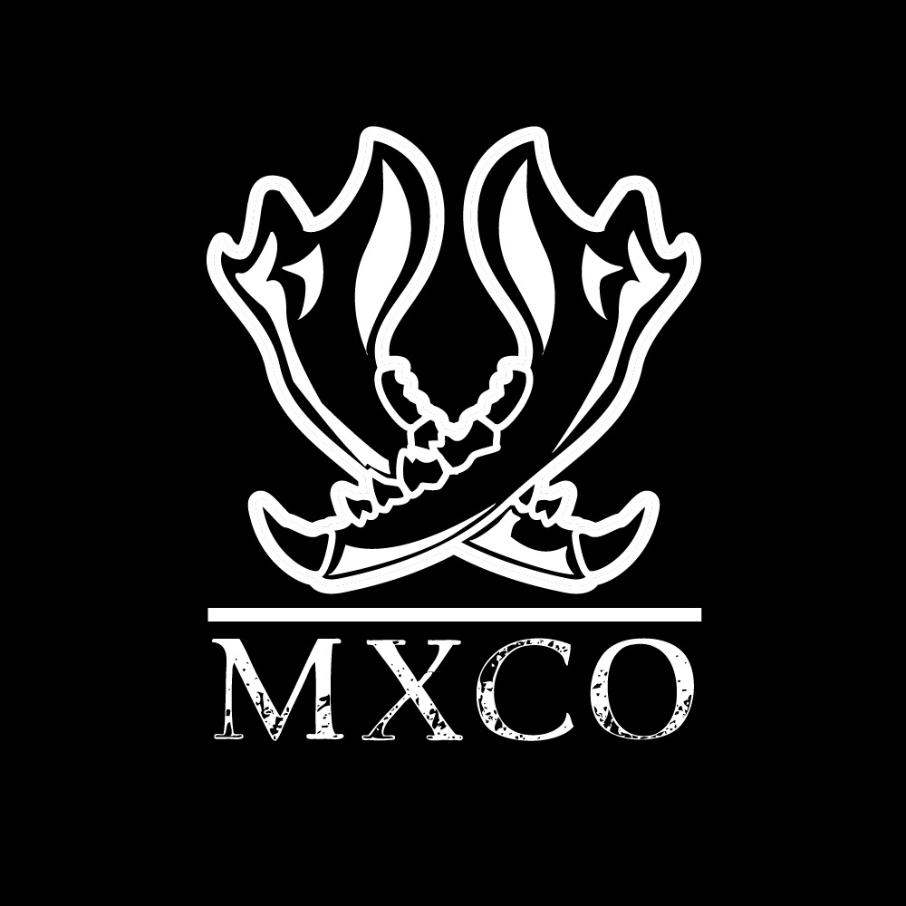
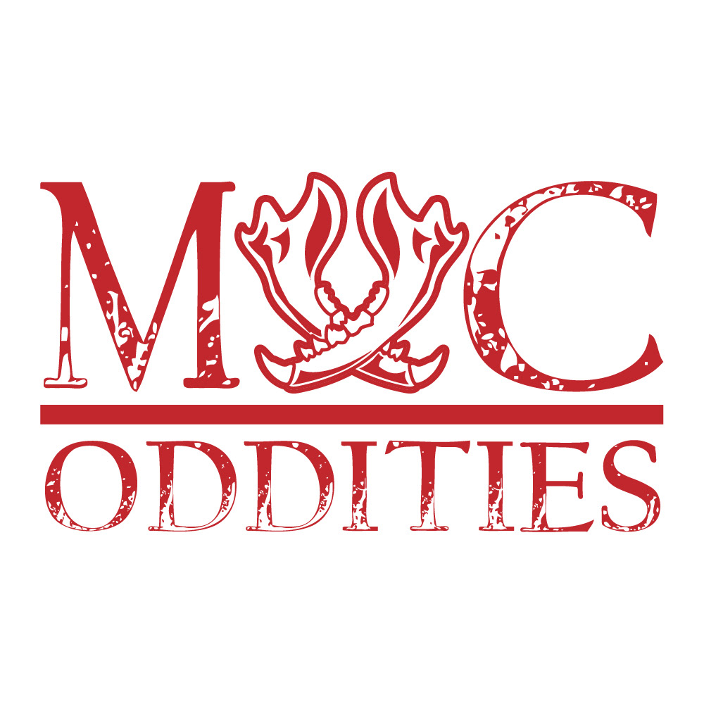
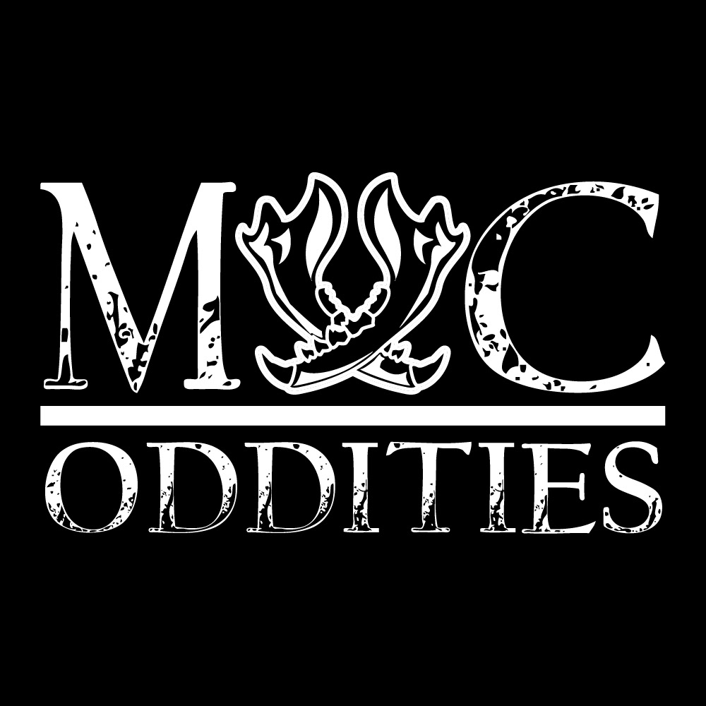
Initial Idea: The concept began with the desire to craft a logo that embodies the eccentric and unconventional nature of the boutique. The idea to use animal jawbones to form the letter "X" in the name "MXC Oddities" stemmed from the central theme of the shop.
2. Research and Inspiration:
Curios and Taxidermy: Extensive research into the taxidermy and curios world was essential to understand the visual aesthetics and thematic elements associated with the business.
3. Logo Design:
Typeface and Aesthetic: The choice of a clean typeface with a grunge aesthetic was deliberate, blending the sophistication of a boutique with the edginess of the oddities theme. The combination aimed to reflect both the elegance and the unconventional aspects of the shop.
Jawbone "X": The most distinctive feature of the logo was the incorporation of two animal jawbones to create the "X" in the name. This design element served as a bold and intriguing visual representation of the taxidermy theme.
Color Palette: The use of black, white, and red in the logo design was intentional. Black and white conveyed a sense of sophistication and timelessness, while red added a pop of color, infusing energy and intrigue into the logo.
Composition and Layout: Careful consideration was given to the arrangement of the elements, ensuring that the jawbone "X" was the focal point without overshadowing the overall design.
4. Prototyping and Feedback:
The logo was prototyped and shared with peers and stakeholders to gather feedback. Iterations were made to refine the design and ensure it effectively communicated the boutique's essence.
5. Finalization and Production:
The final logo design was polished to be high-resolution and print-ready, ensuring that the intricate details of the jawbone "X" would be preserved in any format.