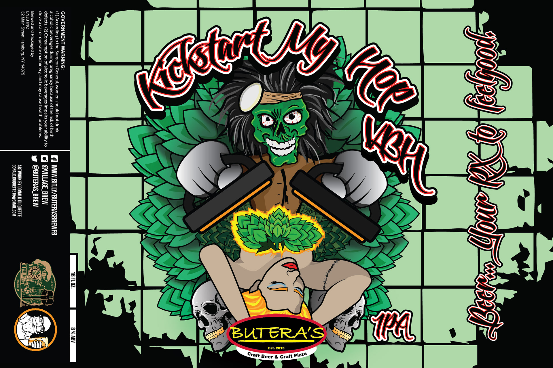
1. Concept Development:
The concept for "Kickstart My Hop" began with a desire to celebrate the energy and rebellious spirit of Motley Crue's music. I wanted to create a label that paid homage to the song while emphasizing the hop-forward nature of the IPA.
2. Research and Inspiration:
To capture the essence of Motley Crue and "Kickstart My Heart," I immersed myself in the band's imagery, stage presence, and the song's lyrics. This research informed the visual elements and style of the label.
3. Logo Design:
Mascot of Motley Crue: The main focal point of the label was the mascot of Motley Crue reviving a pretty woman. This dramatic and vivid scene was a direct reference to the song's lyrics and the band's rebellious image.
Hop Buds Scattered About: To emphasize the hop-forward nature of the IPA, I scattered hop buds throughout the label, creating a connection between the beer's flavor and the music-inspired artwork.
Color Palette: The color palette was influenced by Motley Crue's rock aesthetics, incorporating bold and vibrant colors that captured the energy and intensity of the song.
Typography: I chose a bold and edgy typeface that was reminiscent of rock concert posters, enhancing the label's connection to Motley Crue and the music scene.
Composition and Layout: The placement of elements on the label was carefully considered to ensure that the mascot, the woman, and the hop buds created a dynamic and engaging composition.
4. Prototyping and Feedback:
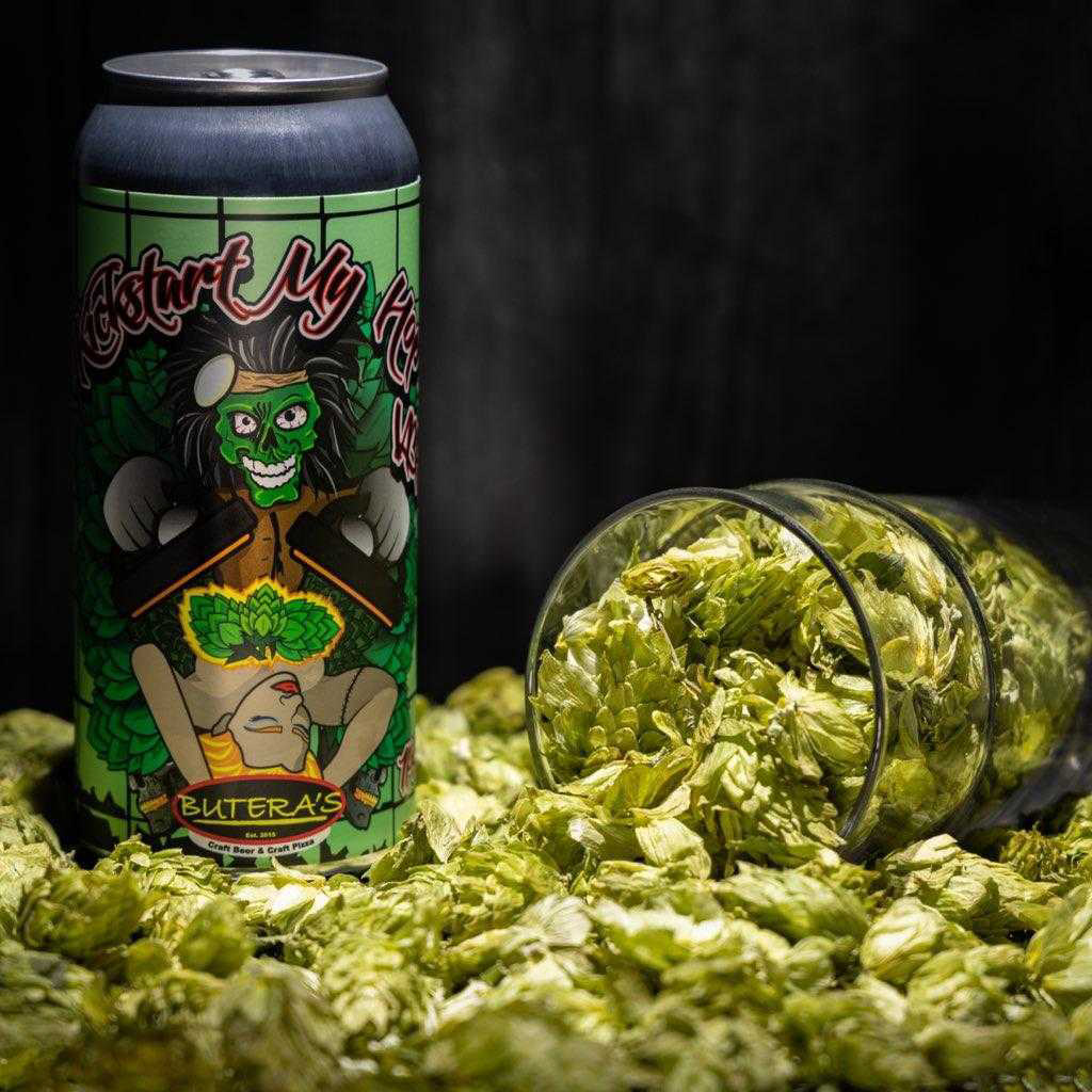
I created prototypes to visualize how the label would appear on a beer can. Feedback from peers and potential consumers was sought to fine-tune the design and ensure it effectively captured the essence of Motley Crue and the beer's flavor profile.
5. Finalization and Production:
The final label design was polished to be high-resolution and print-ready, preserving the intricate details of the mascot, the woman, and the hop buds.