1. Concept Development:
The concept for "Homie Chico" began with the aim of encapsulating the essence of the West Coast and Chicano culture. The focal point was a Chicano character, designed to resonate with the region's identity.
2. Research and Inspiration:
I conducted research on Chicano art, culture, and Southern California imagery to ensure an authentic representation in the design. This research guided the visual elements of the label.
3. Logo Design:
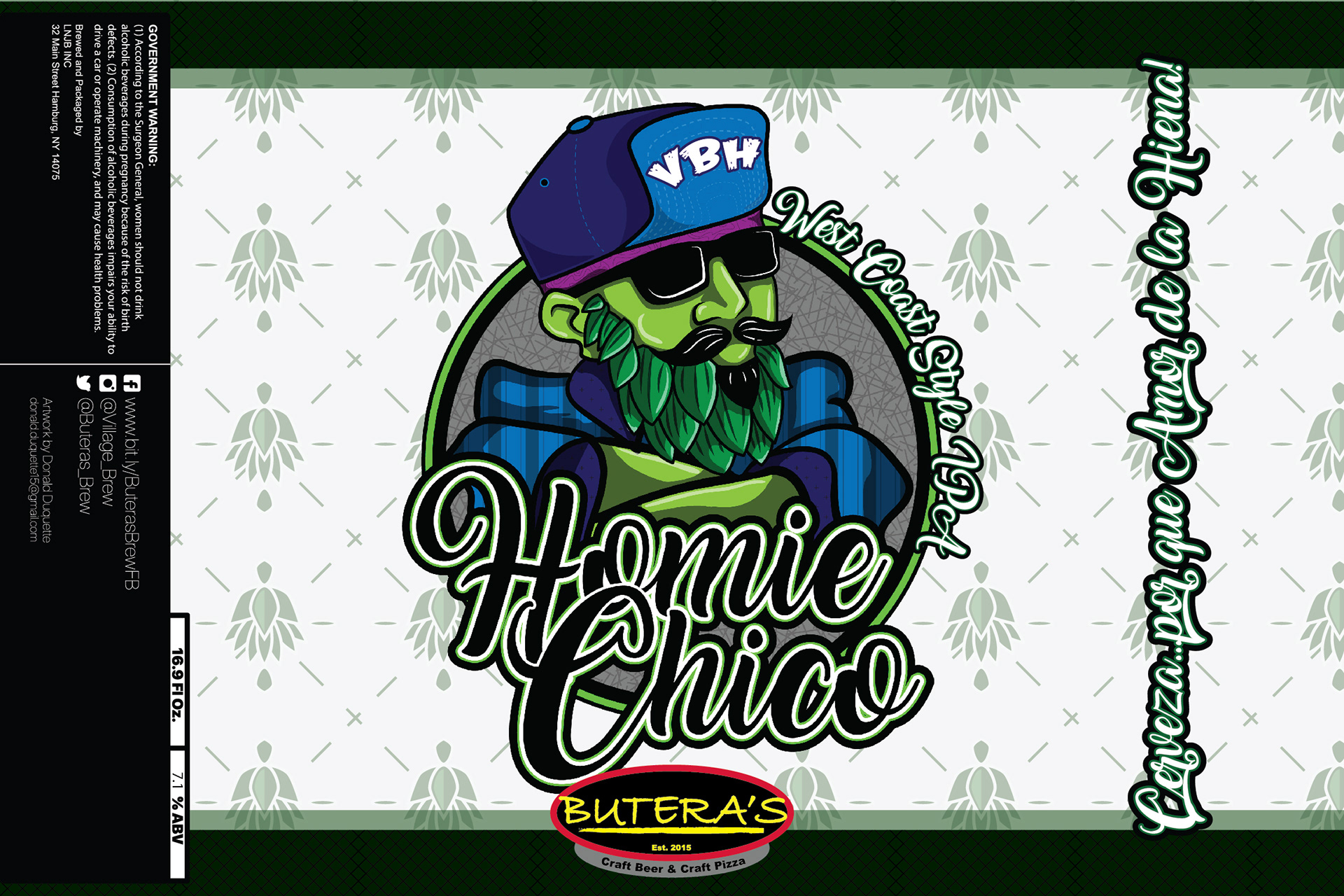
Chicano Character: The centerpiece of the label was the Chicano character. The character had hops for a beard, representing the core ingredient of the IPA, while also infusing the design with a unique and memorable element.
Color Palette: Different shades of green and white were chosen to symbolize the fresh and light taste of hops in an IPA. These colors conveyed the sense of a refreshing and hoppy beer, evoking the West Coast vibe.
Typography: The typography was selected to complement the Chicano-inspired character while maintaining readability and balance. The font choice was influenced by the culture and aesthetics of the region.
Composition and Layout: Careful attention was given to the arrangement of elements to ensure that the Chicano character with the hops beard was the focal point of the label. The placement of the character and text created a harmonious and eye-catching design.
4. Prototyping and Feedback:
I created prototypes and sought feedback from peers and potential consumers to fine-tune the design, making sure it resonated with the target audience and effectively conveyed the brand's identity.
5. Finalization and Production:
The final label design was meticulously polished to be high-resolution and print-ready, preserving the intricate details of the Chicano character and the hop beard.